
Topanga is the name given to the area by the native American indigenous Tongva tribe.and may mean" where mountains meet the see" or"a place above."
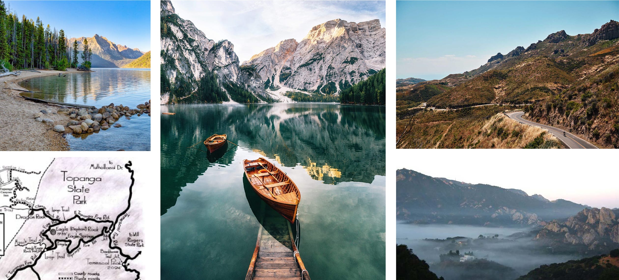
Research & Historical References
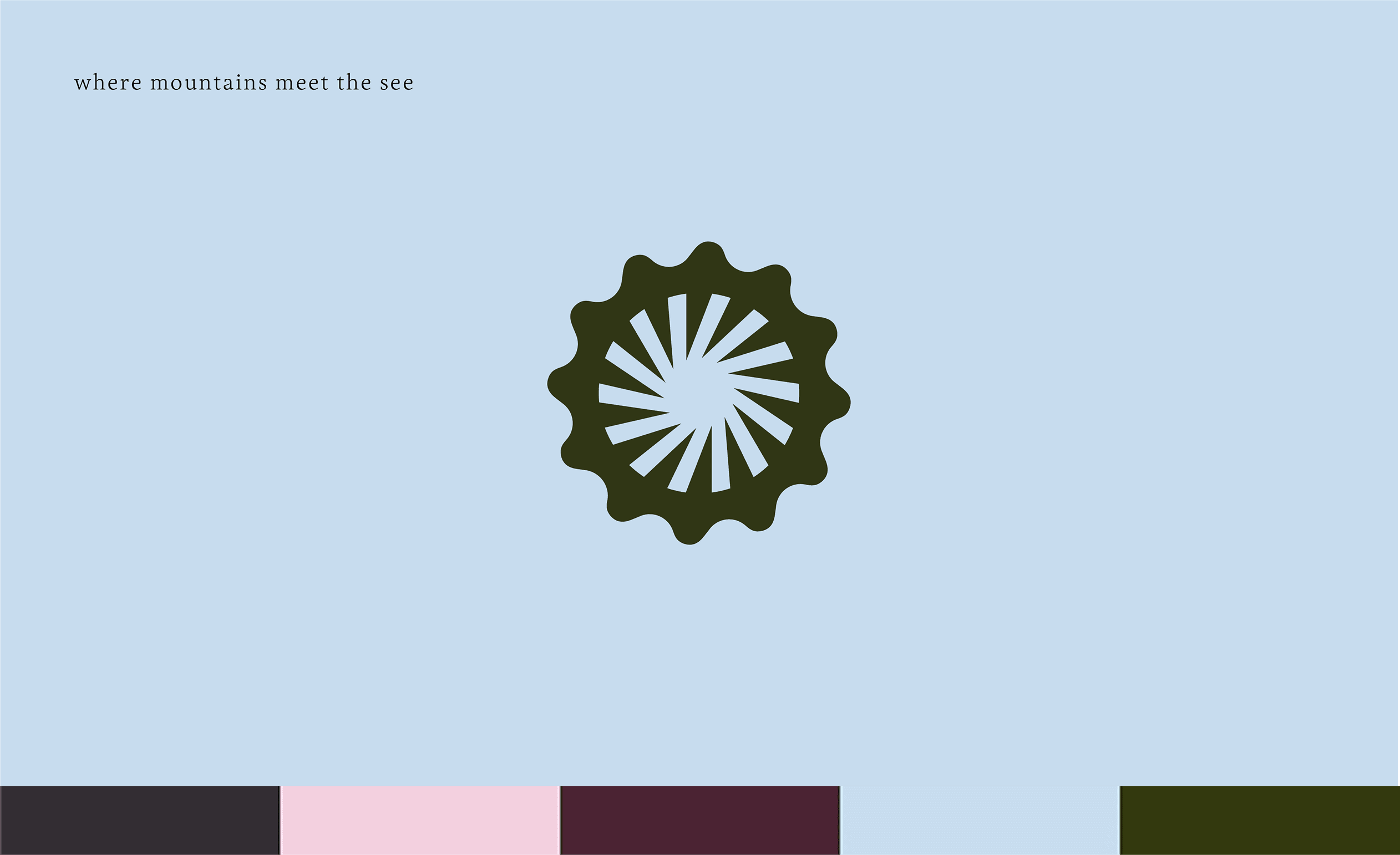
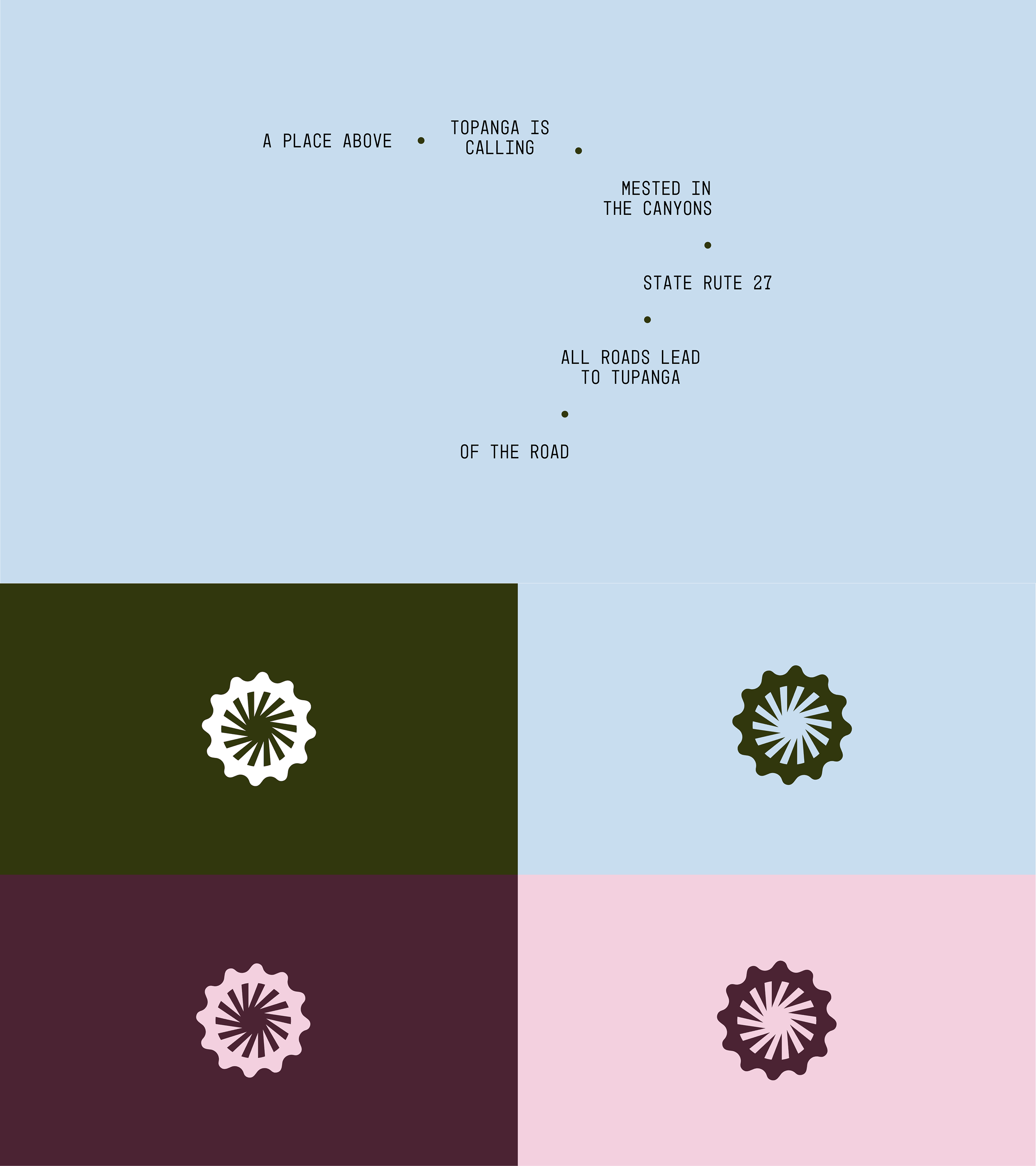
"Where the mountain meets the sea," keeping the same root recognition of a place in my mind, I convert it with Topanga Hotel's identity. I made the rounded shape as the mountain on a crown batch, and they are pointing to the negative space that I had used as a metaphor for the sea."
Rounded curves – reflect the path, calmness, and joy of a space around the hotel.
Emblem Logo – embraces the authenticity, authority, and legacy of a Topanga.
Pointy Diagonal lines – at various angles are forcing the user towards the Topanga Hotel.
Brand Pattern – Conceptually relate back to the geographical map structure, reflecting the grassy and heap experience.
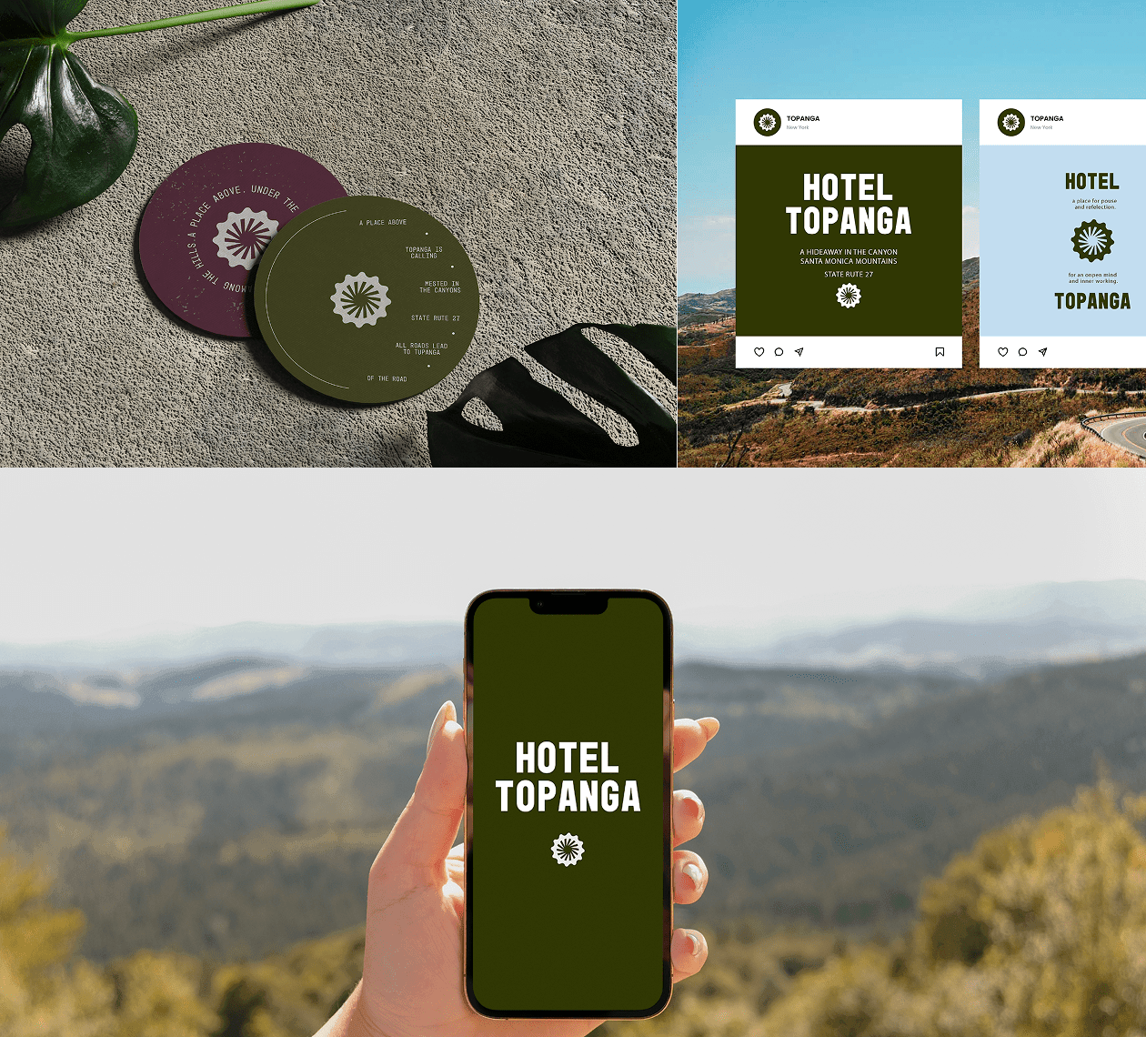
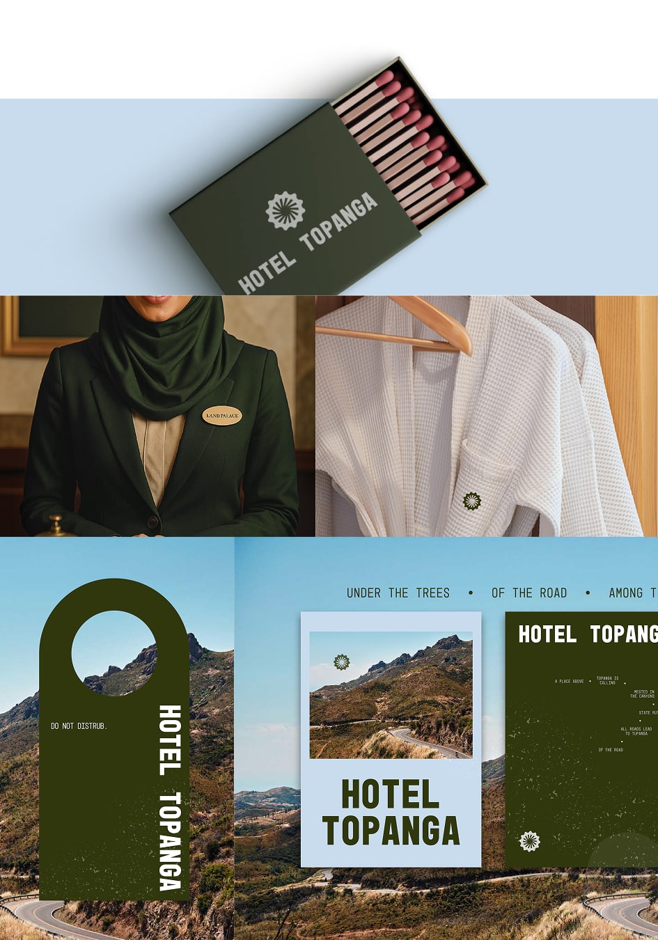
Typeface – He strategically uses both mono and serif typefaces to align the messaging with the grounded social roots of the place.
Color System – The color palette connects to the vibe of the place, the social culture, and the emotional feelings that Topanga aims to evoke, setting them apart in the market.
Identity Footprints

M.AMMAR
Creative Designer